Designing for Seniors and Low-Vision Patients
Many seniors have diminished vision and hearing making navigating a trip to the clinic or emergency department challenging and overwhelming. There are many design elements to consider when planning care spaces for seniors and low vision patients. It is wise to design with three important senses in mind: sight, touch, and sound. Design Studio Blue recently completed the design for the new Banner Boswell Emergency Department in Sun City, AZ. During the design process, we focused heavily on designing for the senses for the retirement community in which this hospital serves.
We will start by sharing our design consideration for the sense of sight. Glare is a negative in any healthcare environment regardless of the patient population. Glare can impair our ability to adapt to changes in light levels, and frankly, it is blinding. A covered approach and vestibule give the eyes a moment to adjust while transitioning from the outdoors to indoors and the next step along one’s journey in care. Eyes need time to adjust to differing light levels so that they can then read signage and see landmarks such as registration desks and elevator banks. In addition, a restricted field of vision and depth perception are common eye impairments. Because of this, avoid high contrast patterns when creating floor designs. Dark colors can be interpreted as a step or hole creating a perceived trip hazard. However, high contrast can be beneficial in other areas of design to draw attention to critical details. Door frames and wall base should stand out from their surroundings. A dark door frame on a light wall announces there is an opening. Black wall base against a light floor and wall creates a break between the floor and wall plane. Dark handrails that contrast against a light wall will make them easier to spot and therefore, use. Restroom components (toilets, grab bars, and sinks) are also more visible when specified in a high contrast color to the wall. Other architectural components that should be in high contrast to their background include stair nosing, wall switches and signage. For writing surfaces, such as registration and check-out locations, a dark colored counter creates contrast for white forms patients need to read, fill out, and sign. Bright and evenly lit spaces create the best clarity for reading and seeing what is in the distance as well as in front of you. Dramatic lighting that creates shadowing and hot spots should be avoided as it can be confusing and hard to interpret with low vision.
Much consideration should go into color selection in spaces for seniors and low vision. As we age, the lens of our eye hardens, thickens, and becomes more yellow. Perception of hue, saturation, and brightness varies. Colors that are hard to distinguish include:
- Navy blue, brown, and black
- Blue, green, and purple
- Pink, yellow, and pale green
I test color palettes by wearing low vision simulation glasses to view color combinations as there are so many variables within hue, saturation, and different types of vision loss.
Touch is also an important sense to consider in terms of floor surfaces. Many patients may shuffle feet or use a cane, walker, or wheelchair. Uneven floor surfaces and transitions between differing floor materials can create a trip hazard. Floating the floors can avoid this design hazard. Ideal floor materials are neither too tacky nor slippery. Clear and unobstructed pathways provide safety. Having clear space at walls will allow for caning and handrail use.
The sense of sound needs to be addressed through acoustics. Seniors may have diminished hearing making background conversation, overhead paging, monitor alarms, and ambient noise impossible to hear over and clearly understand a conversation with their care team. Because healthcare spaces require surfaces that can be easily wiped down and sanitized, they tend to be nonporous and reflect sound. A couple of design considerations would be to extend walls to structure, include acoustical batt within the wall, and to specify an acoustical tile with high noise reduction coefficient (NRC) and ceiling attenuation class (CAC) for acoustical sound absorption. NRC refers to a surface’s ability to reduce noise by absorbing sound. CAC is a standard measurement of a ceiling system’s ability to block sound between two closed spaces. Specify an NRC rating of .80 or greater to absorb ambient sound. A CAC value of 35 or greater is recommended to achieve speech privacy.
Planning patient care spaces for the elderly and low vision requires detailed planning and coordination with all elements of design. Planning through the eyes of the patient from the initial approach to the clinic, emergency, or hospital, the route to registration, and the path to their examination is critical to the success outcome of the experience.
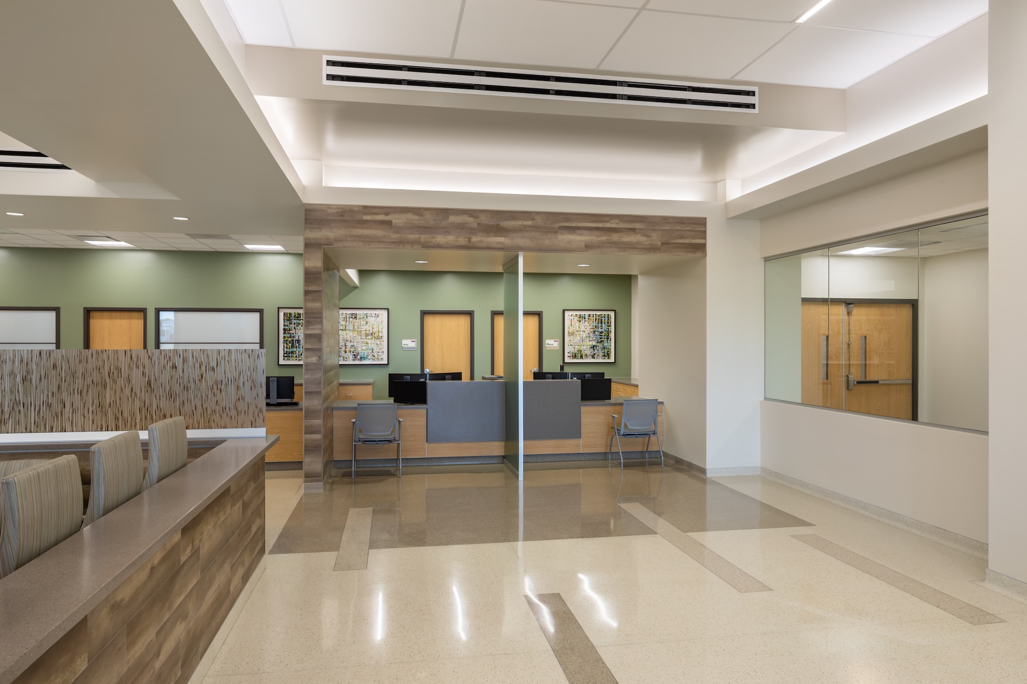
Banner Boswell Emergency Department Registration Desk

Banner Boswell Emergency Department Waiting room designed with senior community in mind.
Written by
Rebecca Brennan, RID, CID, CHID, EDAC, IIDA, LEED AP
Principal | Founder
Design Studio Blue
No Comments